LTIMindtree Design System: Scaling Design Consistency Post-Merger
Introduction
After the merger of LTI and Mindtree, LTIMindtree inherited 45+ internal enterprise portals developed independently across both organizations. These portals lacked a unified design language, visual consistency, and scalable UI architecture. Teams were building interfaces in silos, leading to redundant effort, inconsistent branding, and a poor user experience for over 350,000 users globally.
Many teams were overloaded with post-merger responsibilities, making it hard to prioritize new initiatives. Initially, there was resistance to the idea of a design system due to resource constraints and tight deadlines. Collaboration between design and development was also fragmented, causing delays and inconsistencies. Still, I continuously advocated for the long-term value of a unified system. After several rounds of discussions and showcasing future benefits, I secured leadership support to move forward with the LTIM Design System.
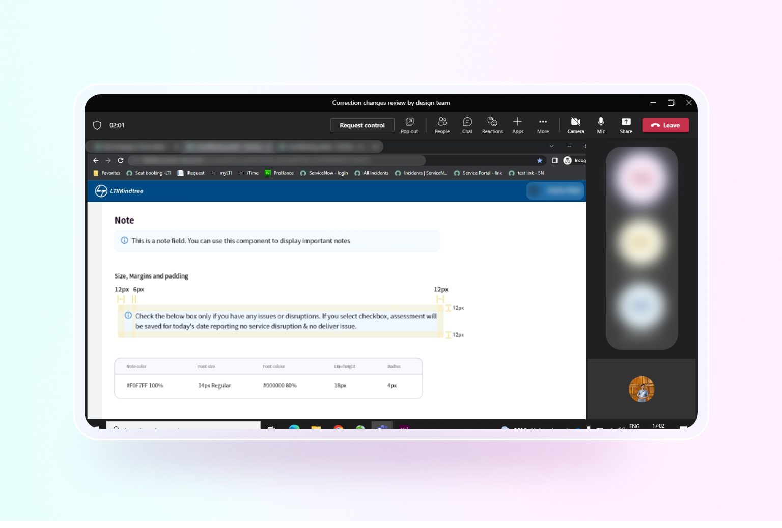
Defined each element as a .Base master component with overrides for states (hover, disabled, error), and established a full Component Life‑Cycle Documentation process, ensuring rapid updates and documentation for every design decision.
Role
Design System Lead
Design Audits
Team
Me (Product designer),
Developers,
Product Managers
Directors (Different BUs)
Sales & Marketing Teams
Project tenure
3-6 Months
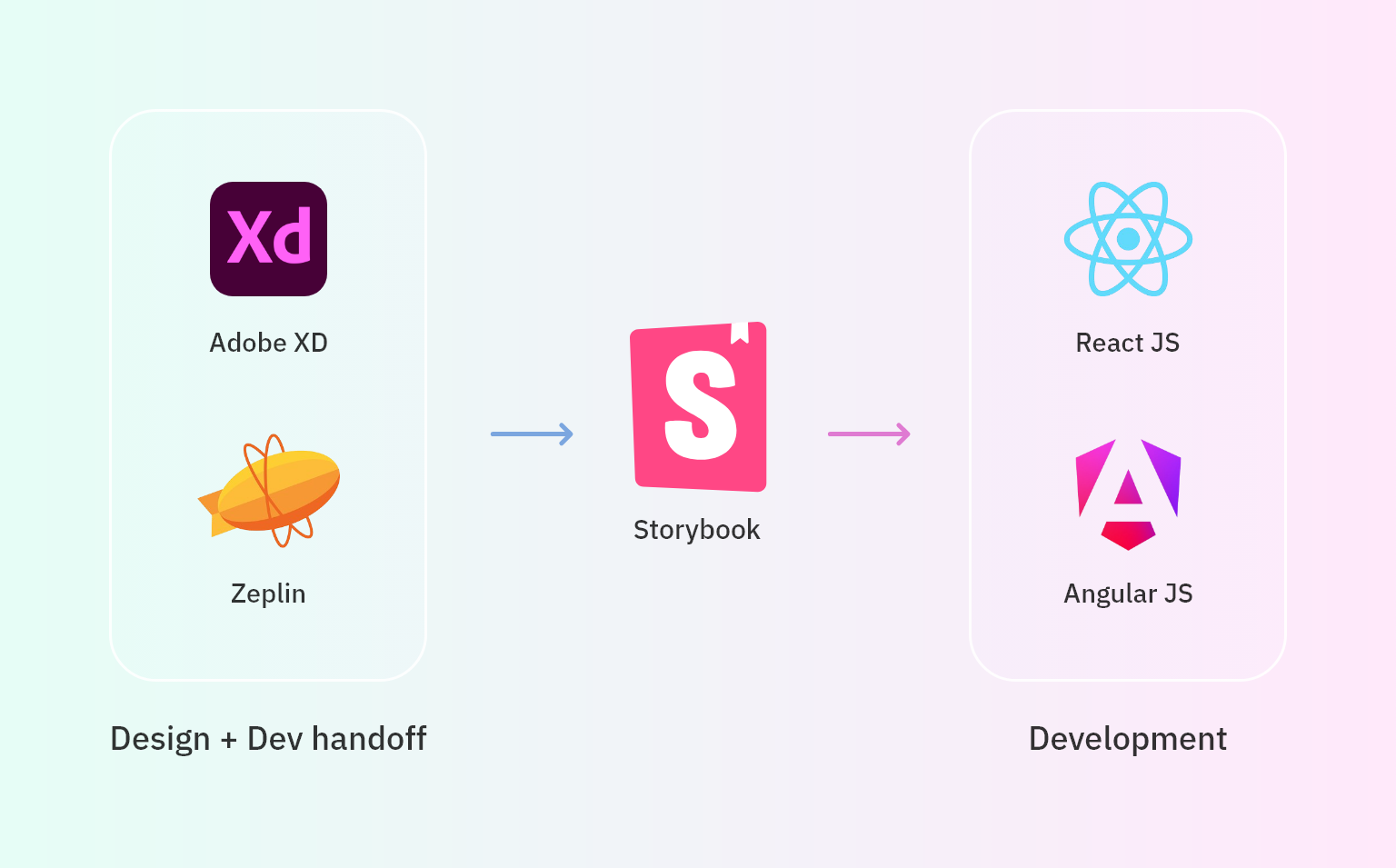
Tools
Adobe XD
Storybook
Zeplin
The challenge 🎯
After the LTIMindtree merger, teams faced major design and development challenges. Developers worked independently across React and Angular frameworks without a shared UI library. There was no common visual identity to support the merged brand, leading to duplicated design efforts, inconsistent UI patterns, and accessibility issues.
The solution 💡
I led the creation of the LTIM Design System, a scalable and reusable UI framework aligned with the brand’s updated guidelines. I streamlined design handoffs, and used Storybook to build accessible, coded components across React and Angular. My front-end background helped me work closely with developers, ensuring feasibility and consistency. Introduced Design Audits to maintain consistency and review development to analyze the design to identify bugs
Preface
When I joined LTIMindtree just after the merger, I felt everything is disconnected and disorganized. There were multiple color palettes, different icon styles, and even multiple fonts were used across different enterprise portals. Design styles were all over the place, design and development teams were redoing the same things, and users had very different experiences across portals. There was a real need of unified Design System to minimize inconsistencies and redundancy.

Research & Ideation
Discovery & Research
To understand how widespread the inconsistencies were, I manually audited 12 key portals, from HR and Finance to VMS and QMS. I documented inconsistencies in buttons, form fields, spacing, and icon styles. To make the issues visible, I captured over 100 screenshots and compiled side-by-side comparisons in Adobe XD. This visual inventory made it easy for stakeholders to see how disconnected our UI elements were across apps.

Stakeholder Interviews
To complement the audits, I conducted 1-on-1 sessions with:
-
6 front-end developers
-
3 QA leads
-
4 BU Directors
-
2 visual designers
-
1 marketing representative
Common themes emerged:
“Every project rebuilds components. There’s no reuse across teams.” – Front-end Developer
“We run into accessibility issues with no consistent design guidance.” – QA Lead
“Our tools feel like distant cousins, not siblings.” – BU Director
Strategy: A Unified Design System
Based on findings, I created a structured pitch deck for a scalable Design System, proposing:
- Central design repository using Adobe XD (Design tool used by LTIM at that time)
- Collaboration across Design, Dev, QA, and Marketing
Presented this to Directors and tech leads in 3 feedback sessions. Post-revisions and sample demos, we received go-ahead from BU leadership. The system was officially named the LTIM Design System.
Building the System
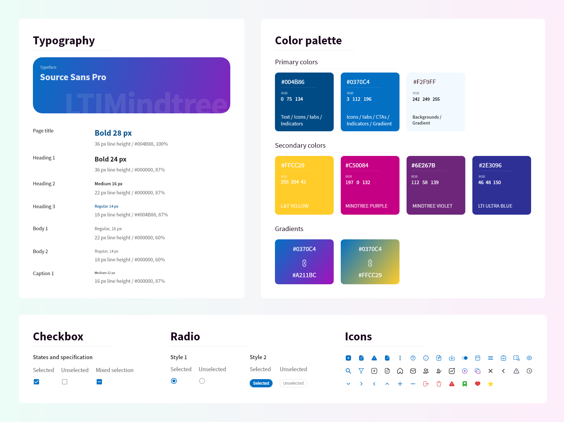
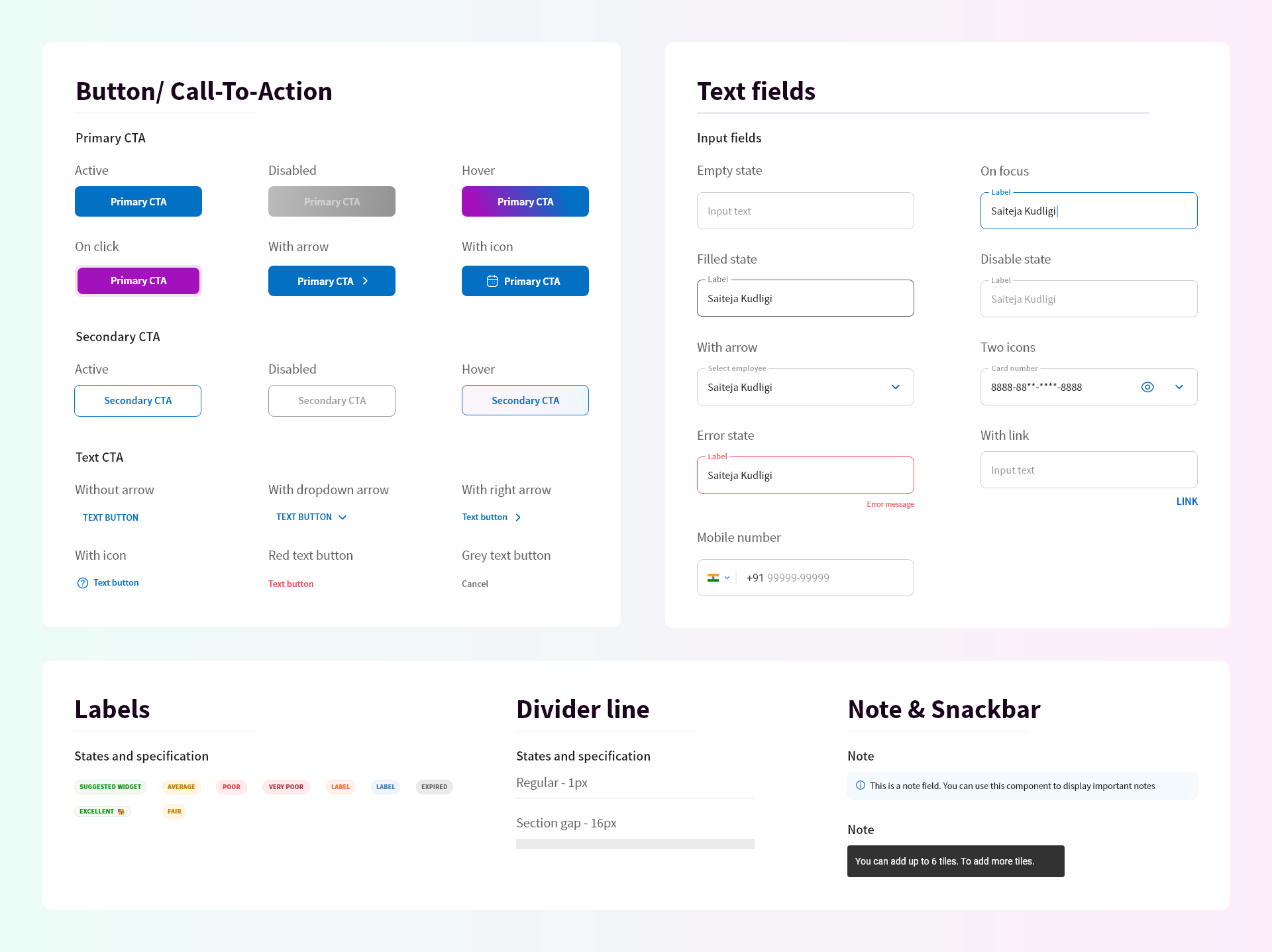
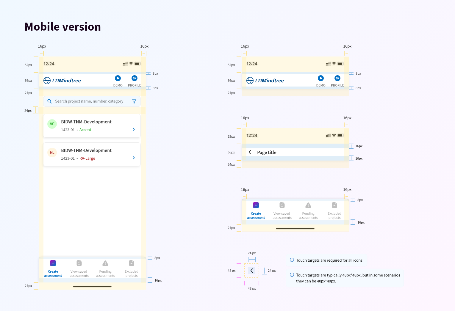
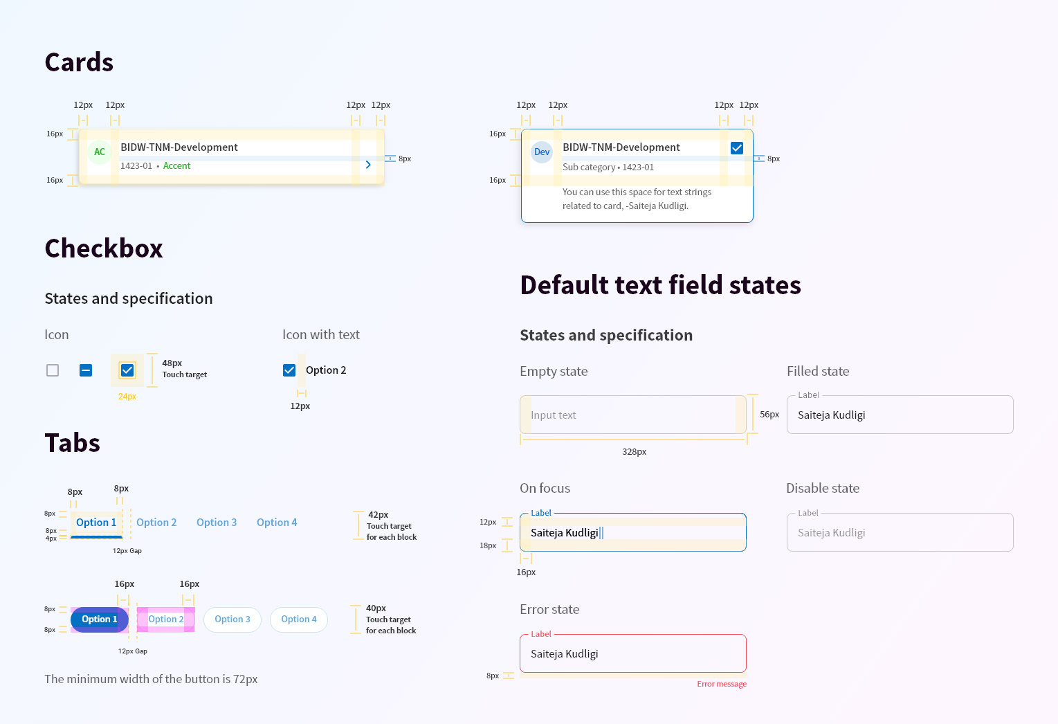
- Foundations: Color tokens, typography, iconography, spacing grids (aligned with brand book)
- Components: Buttons, inputs, dropdowns, alerts, navs, tabs, tables
- States: Default, hover, disabled, error, focus
- Accessibility: All components passed WCAG 2.1 AA guidelines
- Documentation: Included rationale, examples, do’s/don’ts per component
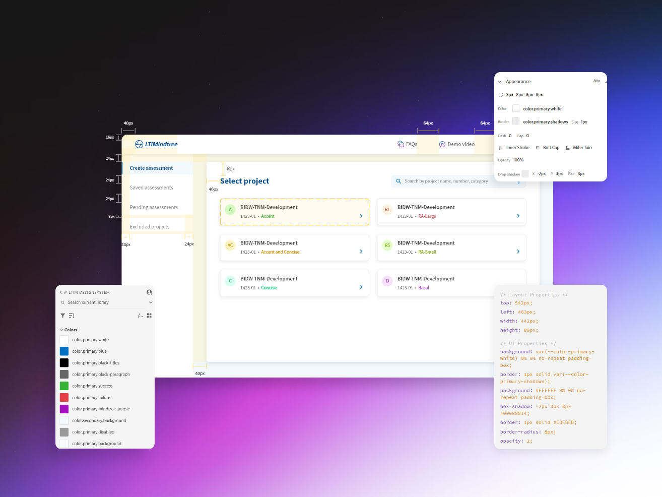
Adobe XD’s Developer View was critical for handoff—developers could easily copy measurements, color codes, and text properties directly from the design. This significantly reduced the time spent on manual annotations or redlining.

Timeline & Process Breakdown
Month 1: Audit & Proposal
- Conducted 12 UI audits across product teams
- Benchmarked 5+ design systems
- Held 15+ stakeholder interviews
- Presented to Directors & BU heads and received approval
Month 2–3: Foundation & Library Design
- Collaborated with Marketing & Sales teams to review the updated Brand Book
- Derived primary colors, fonts, and iconography from brand guidelines
- Created Adobe XD shared library with visual consistency
- Designed 30+ base components (buttons, inputs, navs, modals, etc.)
- Documented usage rules, interaction states, and accessibility standards

Month 4: Dev Implementation & QA
- Paired with developers to implement components in Storybook
- Integrated with teams using both React and Angular frameworks
- Set up versioning via Git + CI deployment
- Reviewed each coded component for parity with XD
- Integrated accessibility attributes (ARIA, contrast, focus states)
- Conducted Design Audits with developers and testers after every major component
Month 5: Rollout & Migration
- Introduced Design Audit Framework – new UIs must comply with system
- Created internal documentation
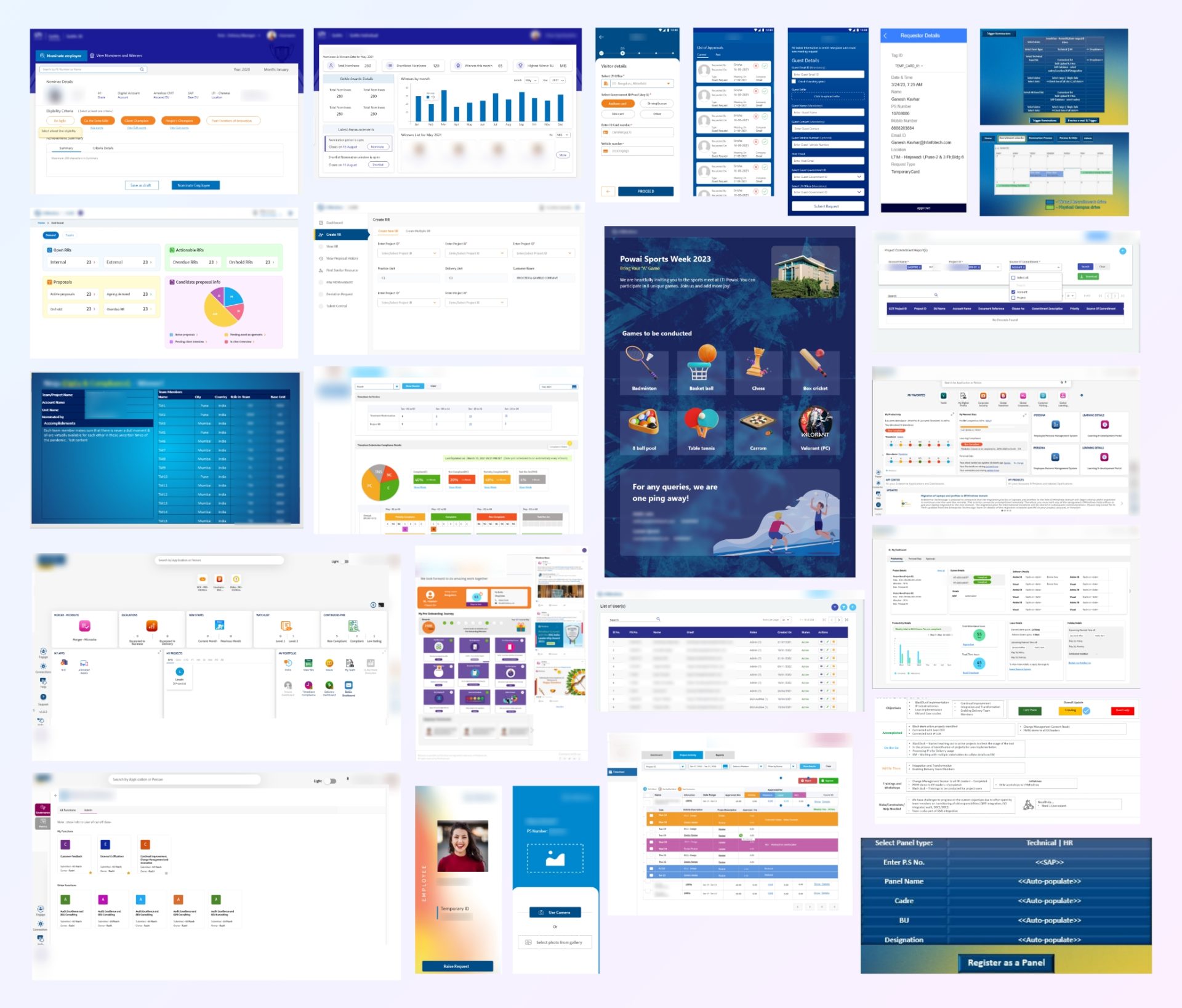
- Migrated 25+ active portals and mobile apps to LTIM Design System
Dev Collaboration & Implementation
- Co-developed components with front-end teams using Storybook
- Integrated into both React and Angular projects
- Emphasized reusability by building scalable, variant-rich components that could be consumed across multiple products
- Weekly design-dev reviews ensured XD–code consistency
- Storybook became a centralized UI library, making it easier for devs to explore, test, and consume components without ambiguity
- My knowledge of front-end helped navigate edge cases quickly and speak the dev language fluently during integration
Operationalizing Design
To make the system a living asset:
- Rolled out Design Audits to validate all handoffs
- Documented changelog & component design guidelines to avoid confusion
- Pushed the Design System to cloud, so that designers from other BUs can drag and drop components.
- Trained designers on correct Base Component usage and instituted peer reviews to eliminate phantom instances (hidden overrides).
Outcomes (Estimated Metrics)
- 80% reduction in redundant UI styles across teams
- 30–40% faster design-to-dev handoffs for portals using LTIM Design System
- 20+ internal portals adopted the system within 6 months
- 50% decrease in UI-related dev bugs from testing team
- +15% internal user satisfaction (IT survey: “UX feels cleaner and consistent”)
- System now supports 350K+ global users
Testimonials
This finally feels like one company, everything looks and works the same across tools.
V Kulkarni | BU Director
This design system saves us hours per sprint. We just plug in components and go.
M Shaik | Front-End Developer
We’re not wasting time arguing about the colors and margins of the buttons and components anymore. That’s a win.
R Pagadala | UX Architect (MIS BU)