How might we the improve conversions, reduce bounce rates, confusion and incomplete user tasks?
Introduction
Mirraw is an online luxury eCommerce platform based out of Mumbai with an average of 10 million app downloads and 2.4 million site visits. Mirraw is extremely focused on ethnic wear and luxury brands. They house both established big names and rising stars, offering exclusive collections. It’s the ultimate destination to level up your style game with a touch of desi spice.
Role
Freelance UX designer
Team
UX Designer
2 Product Managers
3 developers
Project tenure
7 weeks
Tools
Adobe XD
Adobe Illustrator
The challenge 🎯
The outdated interface posed usability issues due to poor categorization and lack of style guidance. This inconsistency hindered user engagement and task completion, resulting in confusion and a high bounce rate. A redesign is urgently needed to enhance user experience and address these shortcomings.
The solution 💡
To make website user friendly and reduce bounce back rates.
- Defined style guide
- Improved Information Architecture
- Simplified existing user flows & built new flows
- Clutter free User experience
My process
Discover 🔍
Client / Stakeholder interviews
Competitive analysis
Usability testing the old design
Ideate 💡
Information Architecture
User flows
Design 💻
Wireframing
Visual design
Design 💻
After building the Information Architecture and user flow diagrams, we started with the paper wireframes. After reviewing these paper wireframes with co-founders and the product team, we converted them into Lo-fi wireframes in XD.
Style guide
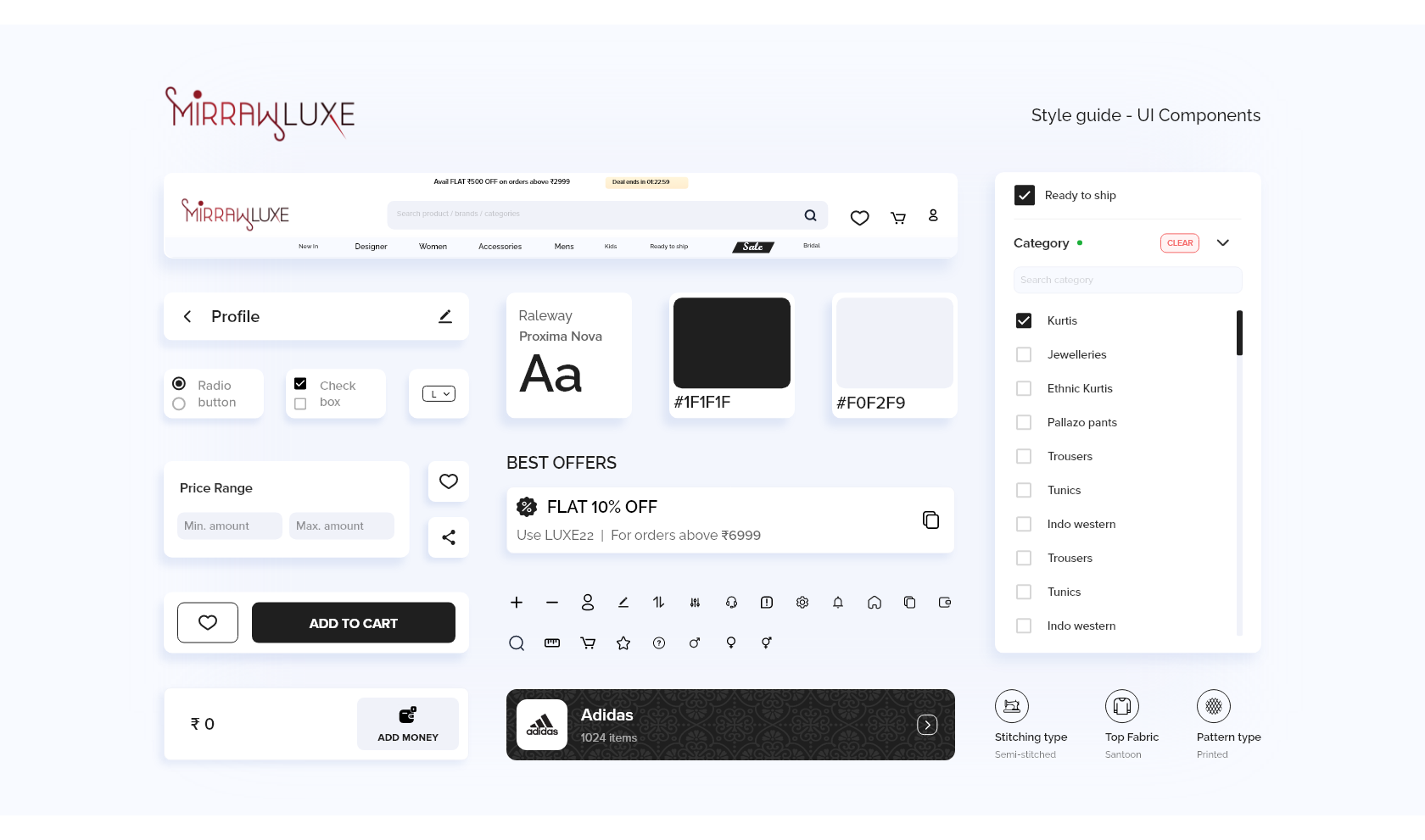
There were no proper guidelines set for visual design. So I’ve worked on building style guide for almost half of the second sprint. I’ve designed all required components, defined a color palette and typography, iconography etc., from the scratch.
Home screen layout
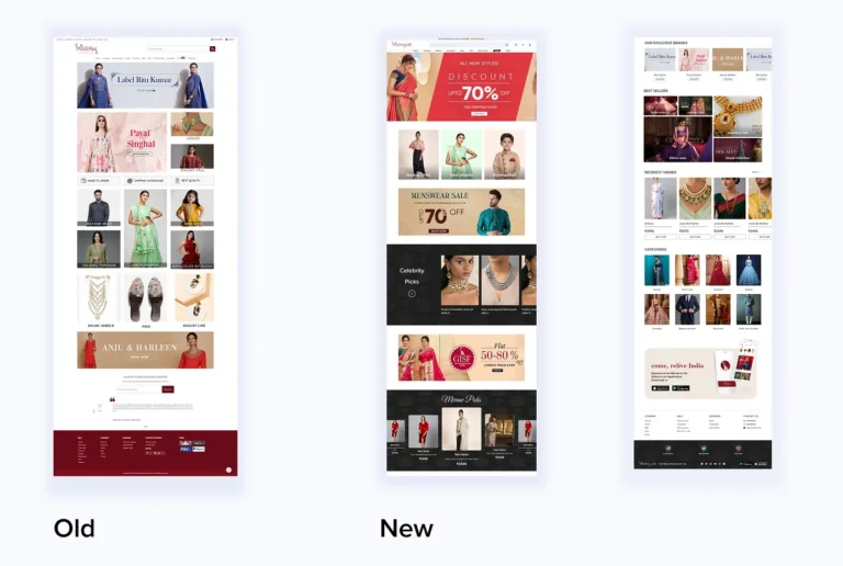
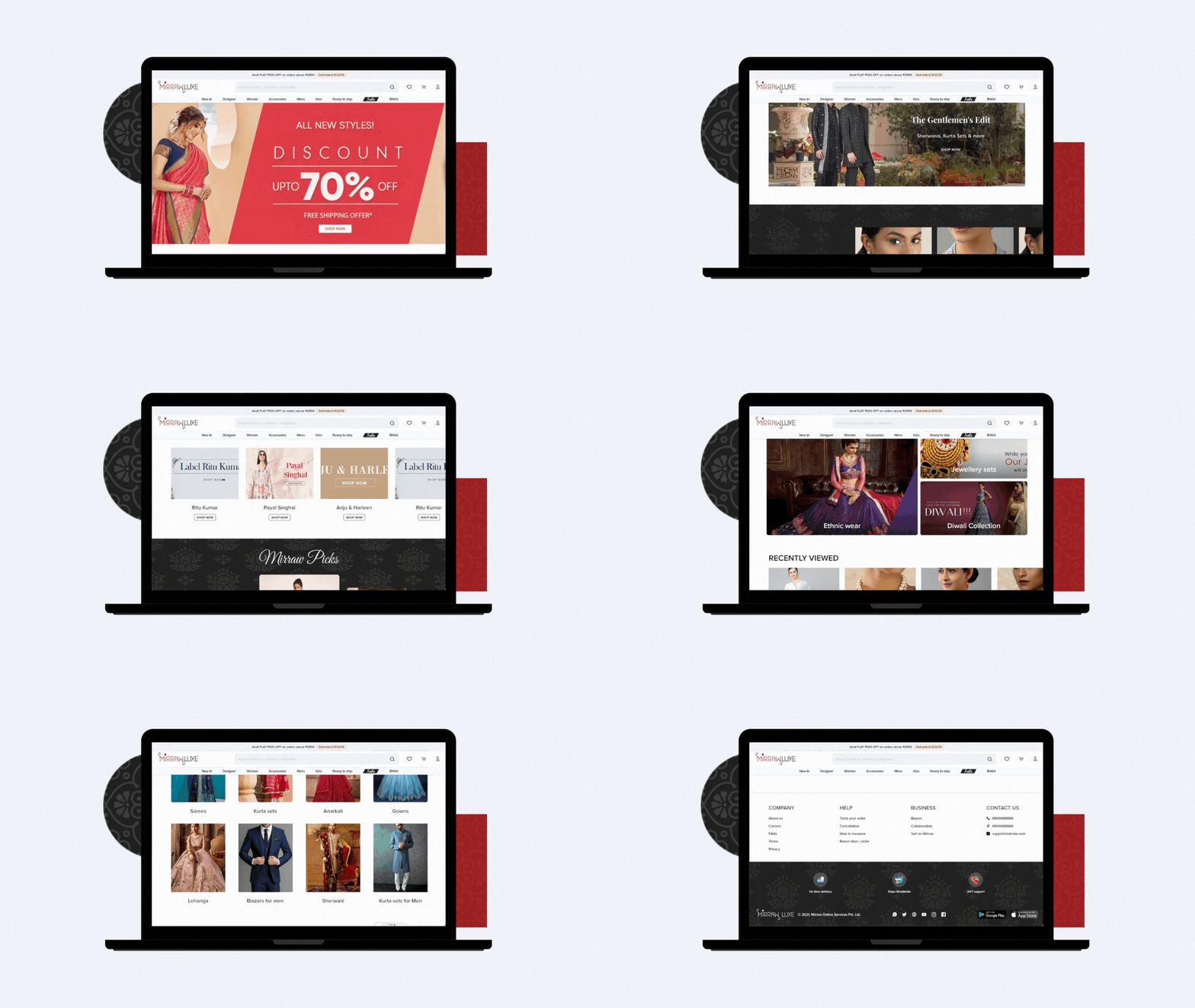
Old home screen was just a showcase of brands and it has less sections to explore. There are some responsive issues with footer.
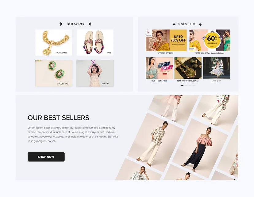
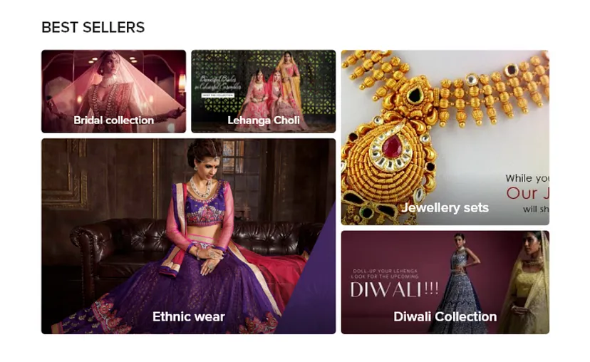
- I’ve made a sensible categorization products and added curative sections like Mirraw picks, Early shipping, Celebrity picks, The accessory realm, bestsellers etc.,
- Changed the footer and bottom nav options. Made bottom navigation much more organized in both desktop and mobile versions. Separated bottom nav options from footer.
Navigation bar
Old Nav bar has lot more data for the users to consume. Improper styling and placing and cluttered layout.
- I’ve switched less priority items to footer.
- Sensible categorization of products
- Showing search, Wishlist, cart and profile upfront.
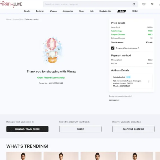
Cluttered Cart screen + Scrollable pop up layout
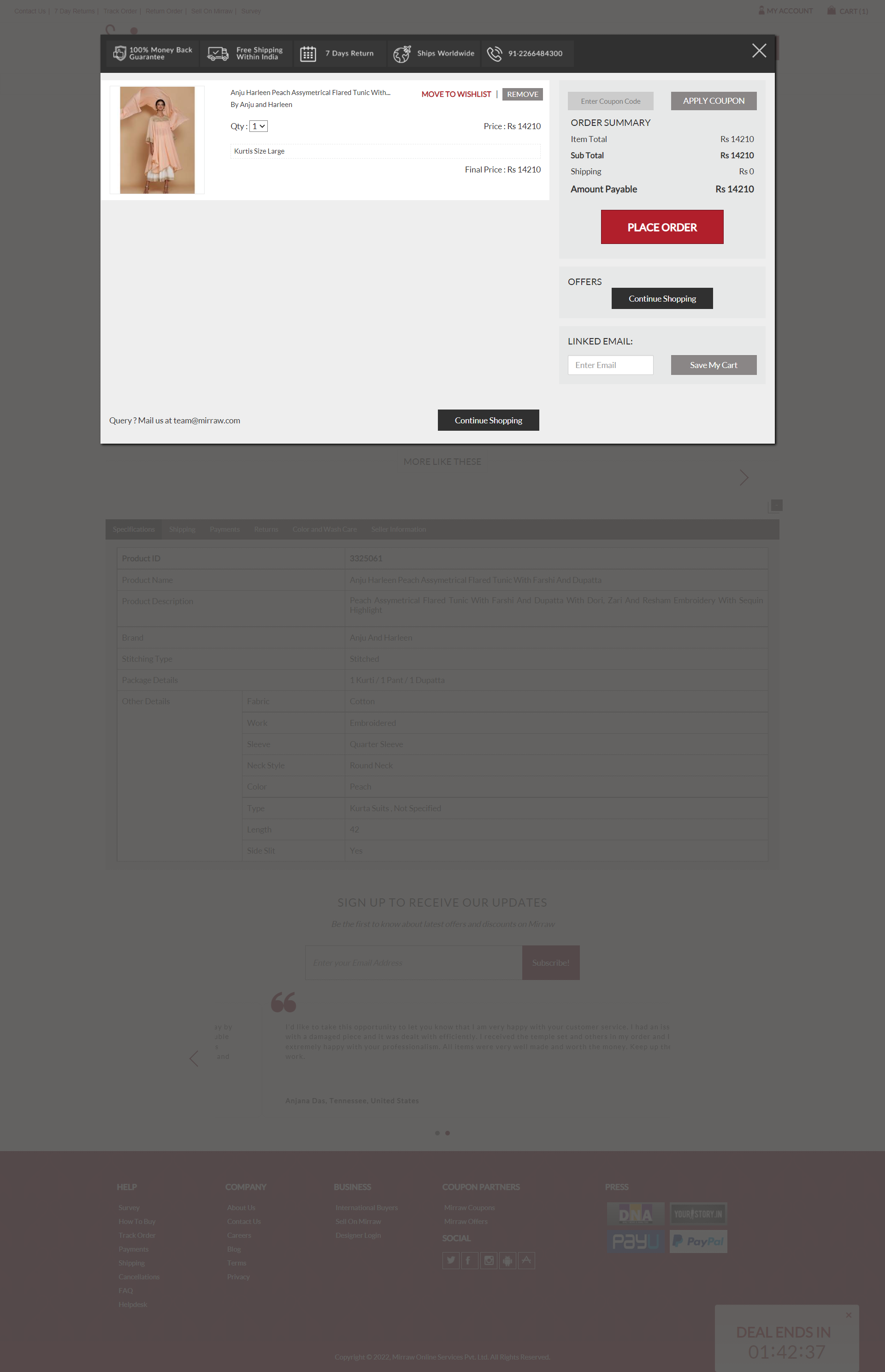
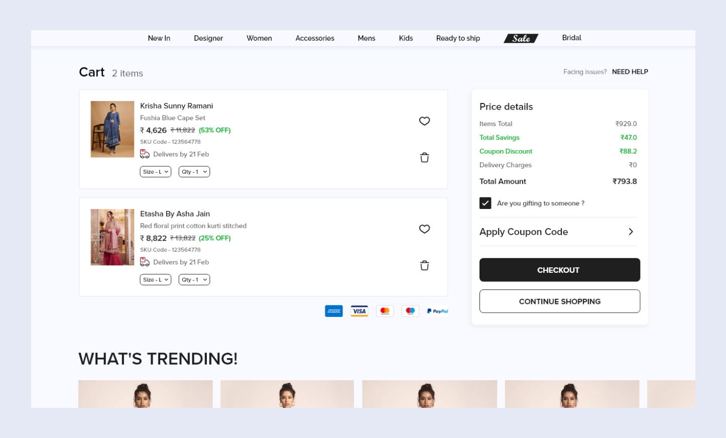
The current cart screen is cluttered and includes unnecessary information, like a non-clickable email ID. It’s a popup that requires scrolling and is not optimized for user experience. Given its importance in the purchasing process, I’ve redesigned the screen to be more compact and user-friendly:
- Increased whitespace to improve readability and item separation.
- Simplified the price details for clarity.
- Added a “NEED HELP” CTA to assist users more easily.
I’ve also added What’s trending, Similar items in cart screen to keep users engaged with the products. At the end of the day, business needs more profits. Users needs more clothes to wear 😉🤑💃
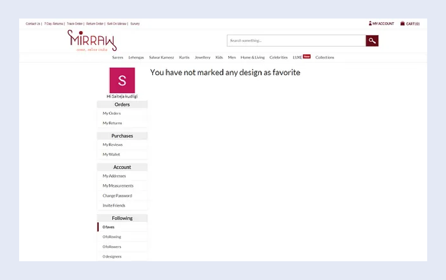
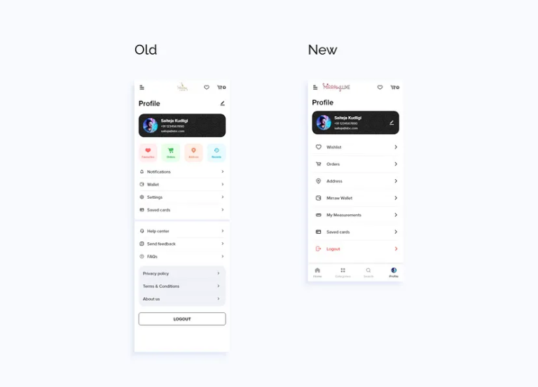
Cluttered profile screen
The profile screen is excessively cluttered, featuring unnecessary options such as “Friends” and “Play Game”. Additionally, there is wasted negative space on the right, and the option to edit the profile is missing.
Solution :
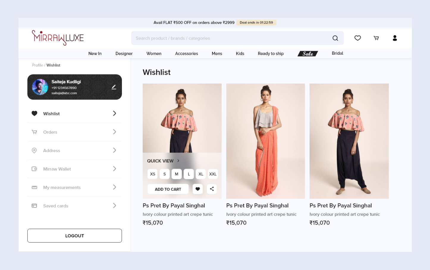
Fixed all those issues. Added new flows like My measurements & Mirraw wallet. Moreover, the new design ensures scalability, accommodating any future profile elements seamlessly. Even if business add any profile element in future, design will be scalable.
Product description screen
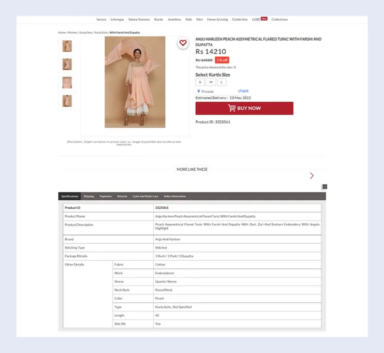
This is one of the most important screens in eCommerce platforms. Spacings and alignments are not proper. It has 4 images left to hero image. If user wants to see another image, they have to click on that image ~5 unwanted clicks. Users were unable to zoom images, In a luxury ecommerce store like Mirraw it’s very important. Because users have to check pattern and design work.
Solution :
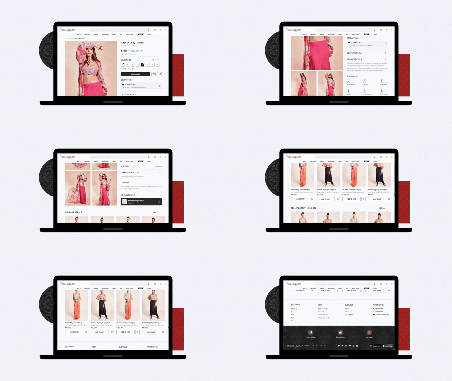
- In the new design, I’ve put all the images upfront. When users hover over an image, they can see a bigger version.
- In the old version, details were hidden behind tabs, leading to extra clicks. In the new design, I’ve positioned all text prominently. There was a lot of text in this screen. So, I’ve added icons for easier understanding.
- I’ve created a sense of urgency for users by using a thunder icon on fast-selling items and showing the number of items left.
- I’ve displayed discounts, applied offers, and additional deals for users. This makes them feel like they’re getting a good deal and encourages them to add items to their cart. After all, good UX design is about understanding how people think and behave.
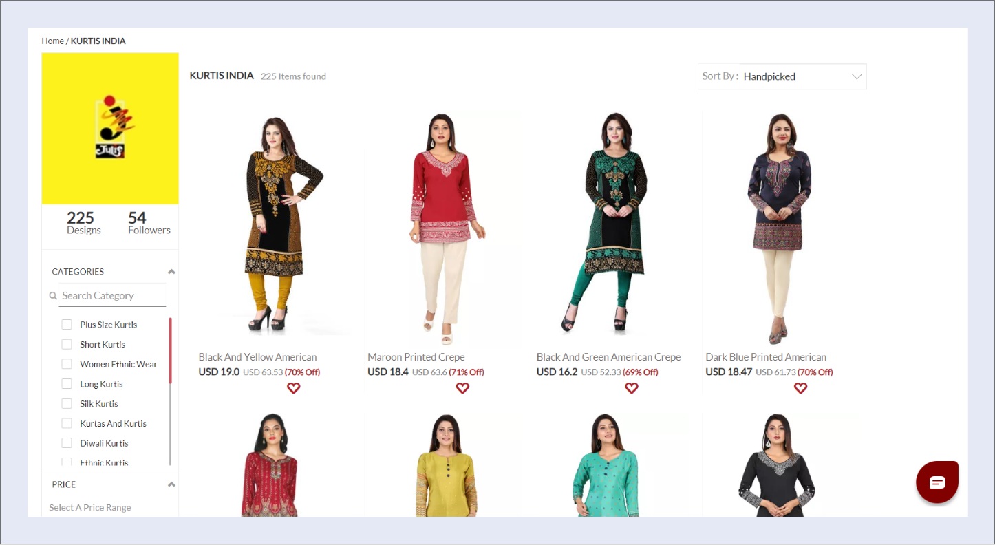
Catalog screen & Issue with white background
- Catalog page is the key screen in any ecommerce site to attract users buying the product. In Desktop version, filter section plays a pivotal for filtering the products which matches users needs. The issue in this screen is Users are not noticing the filter section (based on data obtained from analytics).
- As it is a luxury site, users already have a defined set of taste. Users directly search for top designers and they purchase items.
- Insight that I got from usability testing of old website is, users want to add items to cart from the catalog page itself.
- Some of the brands provide images with white BG, If we place 6 of those images in a single screen, it’s resulting in increasing of the white space and looking bit odd.
Solution :
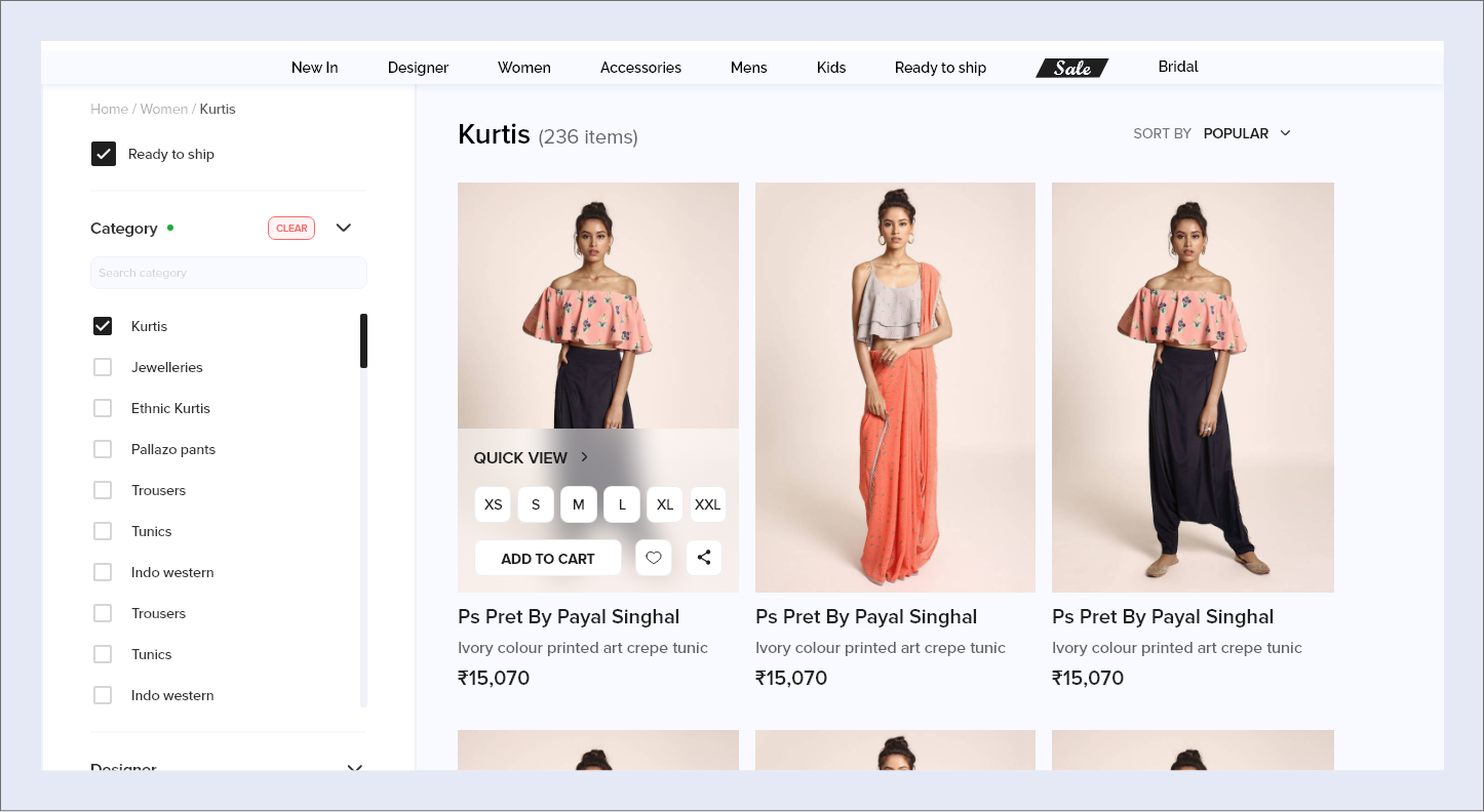
- I’ve defined the background color as #F0F2F9. This solves the issue of the white background behind the images. Additionally, it helps distinguish the filter panel from the rest of the products in the catalog section. I’ve designed the filter section to be easily noticeable.
- As discussed earlier, issue with the filters panel is also fixed with this background color.
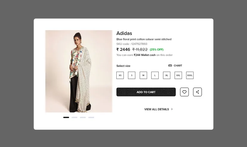
- Regarding the images, I’ve emphasized them more so that users can see every detail clearly. Therefore, I’ve changed the layout from a 4-column to a 3-column format. Additionally, I’ve provided a “Quick View” option, allowing users to add items to their cart without visiting the description page. This feature benefits users who prefer adding multiple items to their cart at once.
- If users wish to view all the details of an item, they can click on “VIEW ALL DETAILS,” which will redirect them to the Product Details Page (PDP).
Empty screens and popups
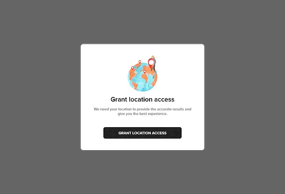
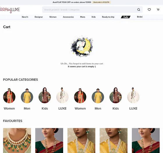
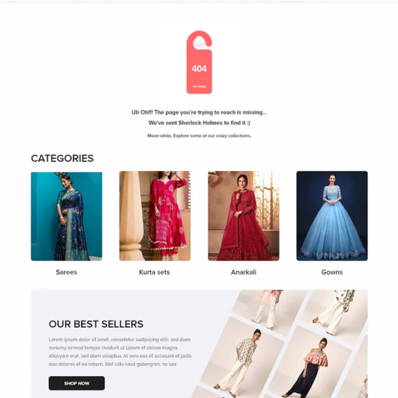
I’ve created mood boards for illustrations and showed it to users. For illustrations, I’ve picked a set of 3D, Flat and water colored illustrations. Almost all users opted for water colored illustrations, as that is more pleasing. I’ve specifically picked out elephant illustrations, Because Mirraw logo consists of elephant.
Iterations
There are few iterations that we have encountered due to responsive constraints and user feedbacks. Out of them, profile screen ended with major layout change.
Profile
In profile, initially I went with the left design. But as it has some constraints when it comes to responsiveness. Help center, privacy policy and few other components are shifted to bottom nav/footer.
As we got bottom nav in mobile along with hamburger menu, I’ve made LOGOUT as a list element instead of CTA.
Increase app downloads
As there is gradual reduction in the Mirraw app downloads, I’ve designed a banner to nudge users to download the application.
Final points
- I’ve learned how image sizes and placement of sections differ from normal eCommerce to a luxury platform.
- I’ve worked on and built a style guide for Mirraw. This is my first time working on style guides. Lots of research, late-night calls, and tons of learning were involved.
- Keeping the user at the center, I started this project with usability testing on the old website to identify the user’s pain points. I conducted multiple A/B testing sessions after the design phase. I believe in user-centered design, and in pursuit of this, I engaged in multiple debates with the Product and Sales teams.
