HMW Design A Scalable, Low-Cognitive-Load Seat Booking System for Hybrid Workplaces

Overview
When I joined LTIMindtree, the organization was in the middle of a major transition. LTI and Mindtree had recently merged into a single entity, and as part of the consolidation, several internal portals were being sunset, including Mindtree’s seat booking portal. So LTI's portal became default.
Around the same time, post-COVID work policies shifted from fully remote to hybrid. Employee strength increased significantly, offices reopened across multiple campuses, and seat booking became a frequent, everyday task.
I was asked to redesign LTI’s seat management portal, keeping both LTI and Mindtree employees in mind, and help the organization support this new way of working at scale.
Role
Senior Product designer
Team
Product managers
Engineering
Project tenure
3 months
Stakeholders
Facilities, Admin, Engineering and HR teams
TL;DR
As LTIMindtree transitioned to a hybrid work model after the LTI–Mindtree merger, employees struggled to find seats across campuses, while admins lacked visibility and control over seat allocation. I worked on redesigning the seat management system to make booking frictionless for employees and operationally scalable for admins.
The Real Problem
At first, the problem appeared to be about seat availability. But as I dug deeper, it became clear that availability wasn’t the core issue. What I noticed was decision fatigue.
Employees were expected to:
Understand new hybrid policies
Remember eligibility rules across cities and campuses
Interpret why seats were unavailable
Browse alternatives without much context
Admins and Facilities teams, on the other hand, were:
Manually correcting bookings
Managing seat segregation and BU rules
Updating floor maps as offices evolved
Working with data they didn’t fully trust
The system wasn’t broken, it was simply asking people to manage complexity it should have handled itself.
Design Goals
Before proposing solutions, I wanted to ensure my assumptions matched reality. I combined:
Employee surveys, to understand booking patterns, repetition, and frustration points
Stakeholder interviews with facilities and admin teams, to understand policies, edge cases, and operational constraints
Rather than treating employees and admins as separate audiences, I focused on how decisions made in one flow impacted the other.
What Employees Shared
From survey responses, a few themes kept coming up
Booking seats felt repetitive, even for frequent office-goers
Users weren’t always sure why seats were unavailable
Browsing through alternatives took longer than expected
Many users preferred the system to guide them instead of making them search
One response captured it well and strongly influenced how I approached the solution.
What Stakeholders Highlighted
In parallel, conversations with admin and facilities teams revealed another side of the problem.
Bookings didn’t reliably translate to actual usage
Seat segregation by BU, ODC type, and availability required constant oversight
Admin workflows were powerful but fragmented
Floor map updates were frequent and error-prone
This revealed a core tension, a simple employee experience depends on a powerful admin system behind it.
When I mapped employee feedback alongside stakeholder concerns, a clear insight emerged. So, I reframed the problem.
How might we design a system that simplifies decision-making for employees, while giving admins precise control over seat availability, management, and data?
This reframing guided every major design decision that followed.
Defining Personas
Before jumping into ideation, we defined personas based on different user needs.
Hybrid Associate
A professional who follows a hybrid work model, splitting time between remote work and office work. They book seats based on availability in their base city. This is the most common persona.
Behaviors:
Logs in to the portal only on specific in-office days.
Prefers consistency in seat location for better collaboration.
Might cancel and rebook frequently depending on schedule changes.
Work From Office Users
An employee with a permanently assigned seat that requires minimal changes. This is 2nd common persona as half of the employees WFO.
Behaviors:
Rarely interacts with the booking system unless a change is required.
Primarily checks seat details rather than actively booking.
May need occasional hot desk access but lacks an intuitive way to do so.
Hot Desk Users
An associate who does not have a fixed workspace and books seats temporarily when working away from their base location.
Behaviors:
Often books on short notice when needing office space.
May book for different locations depending on work needs.
Reviews and cancels bookings frequently based on availability.
Crazy 8s & SCAMPER
Before settling on a direction, I collaborated with UXR team and explored multiple approaches to challenge early assumptions.
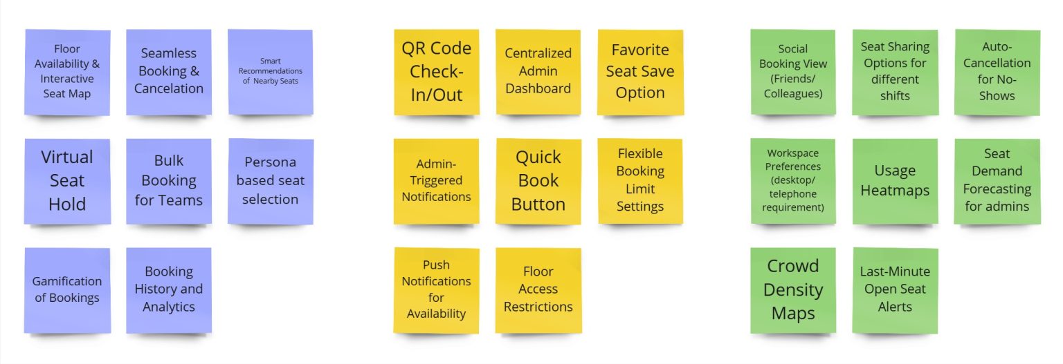
We reached out to PMs from other business units and key stakeholders to vote on the top 10 features.
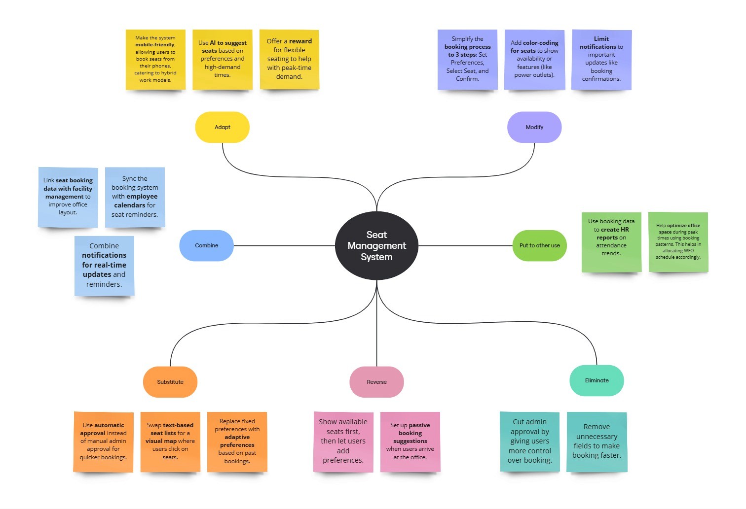
Substitute manual browsing with system recommendations
Combine seat selection with team context and favorites
Adapt saved preferences across bookings and personas
Modify admin tables into spatial floor-map editing
Eliminate repeated inputs and unnecessary confirmations
These explorations helped me move beyond incremental UI tweaks and rethink how the system should behave.
Design Principles I Anchored On
Based on insights and exploration, I defined a few principles that guided the design.
System-led, user-controlled
The system should recommend, not dictate
Recognition over recall
Show context instead of making users remember it
Progressive disclosure
Advanced controls appear only when needed
Design for one, extend to many
Shared logic, role-based access. Separate flows for admins & employees in a single portal.
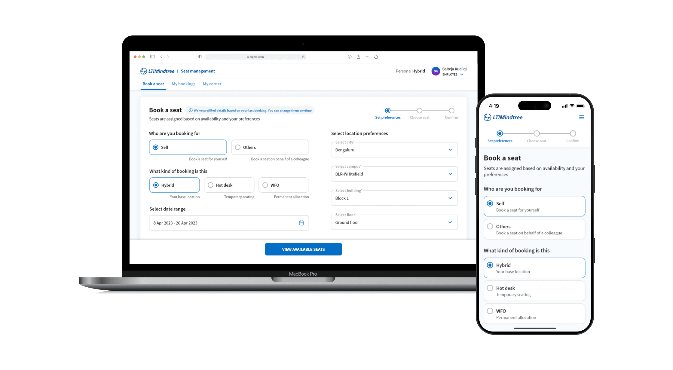
Select and manage seats with ease
I designed a three-step booking flow. Set preferences → Choose seats → Confirm booking
Preferences helps users to narrow down seats. Provided an option for auto-fill to reduce effort & time.
Seat Selection That Explains Itself
Seats are grouped into:
Preferred seats, auto-assigned based on saved preferences
Recommended seats, shown only when preferred options aren’t available
My Corner, showing where teammates are seated
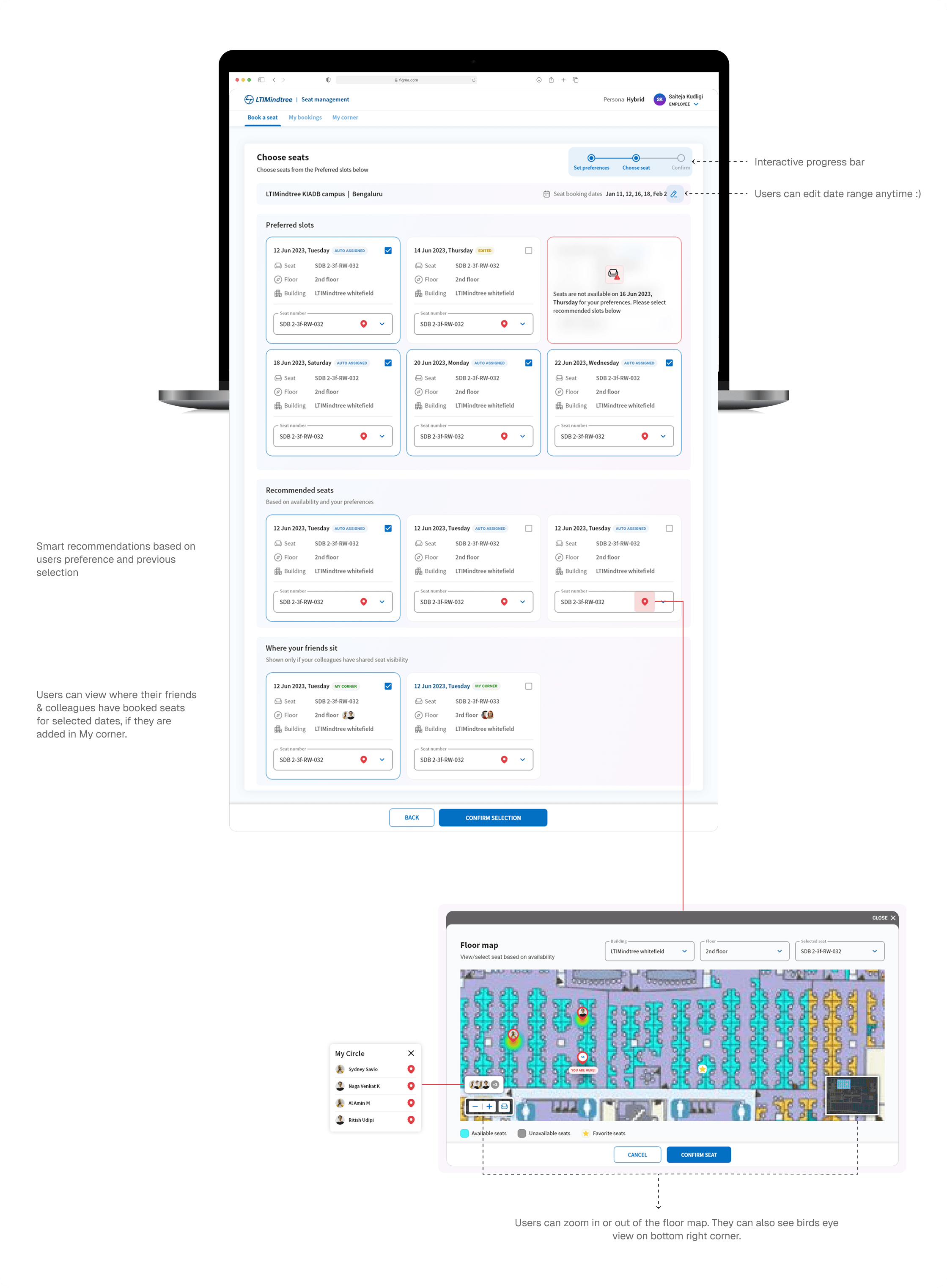
Made seats feel real with Floor Maps. I designed interactive floor maps that show real-time availability, integrated zoom and bird’s-eye views. I designed multiple iterations for "Choose Seats" screen, with compact cards. As the portal is new, we chose clarity over compactness.
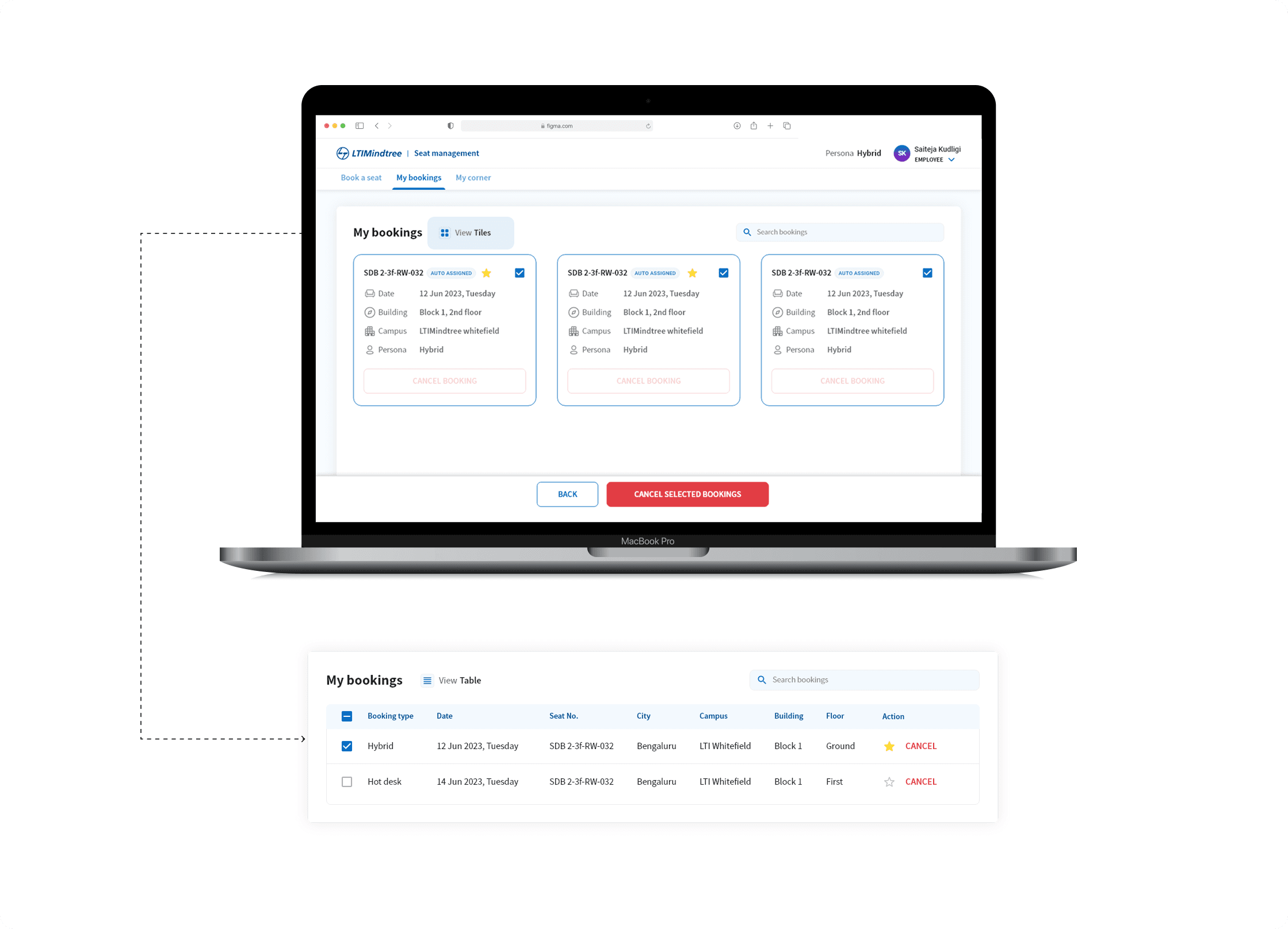
My Bookings & Self-Service
Employees can:
View bookings in table or tile view
Cancel bookings independently
Edit or remove seats before confirmation
My Corner & Favourites
I introduced My Corner, where users can:
See where teammates are seated
Manage a personal circle
Save favorite seats for faster future bookings
This acknowledged the social nature of office work without forcing it.
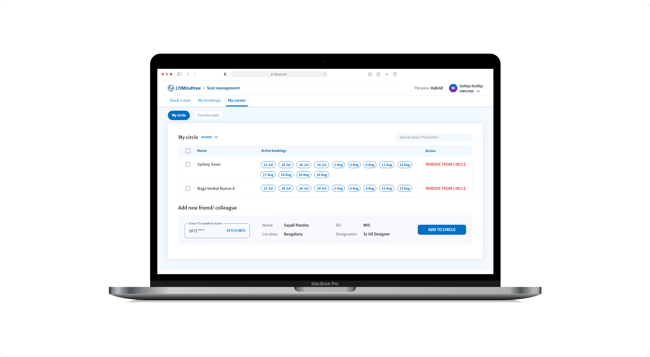
I experimented with two design approaches for this screen. The first used a modal for adding new members to “My Circle.” After evaluating usage patterns, we moved to an inline interaction to reduce cognitive load and interaction cost, aligning better with enterprise workflows.
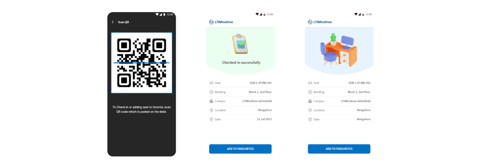
Closing the Loop with QR-Based Check-In
Stakeholder interviews repeatedly surfaced concerns around no-shows.
I proposed a QR-based check-in flow, and we worked with engineering and facilities teams to align it with on-ground processes:
Users confirm physical presence by scanning a desk QR code
Seats not checked in can be released
Admin Experience - Designing for Control & Scale
While employees interacted with a simplified interface, I designed a dedicated admin flow to absorb system complexity.
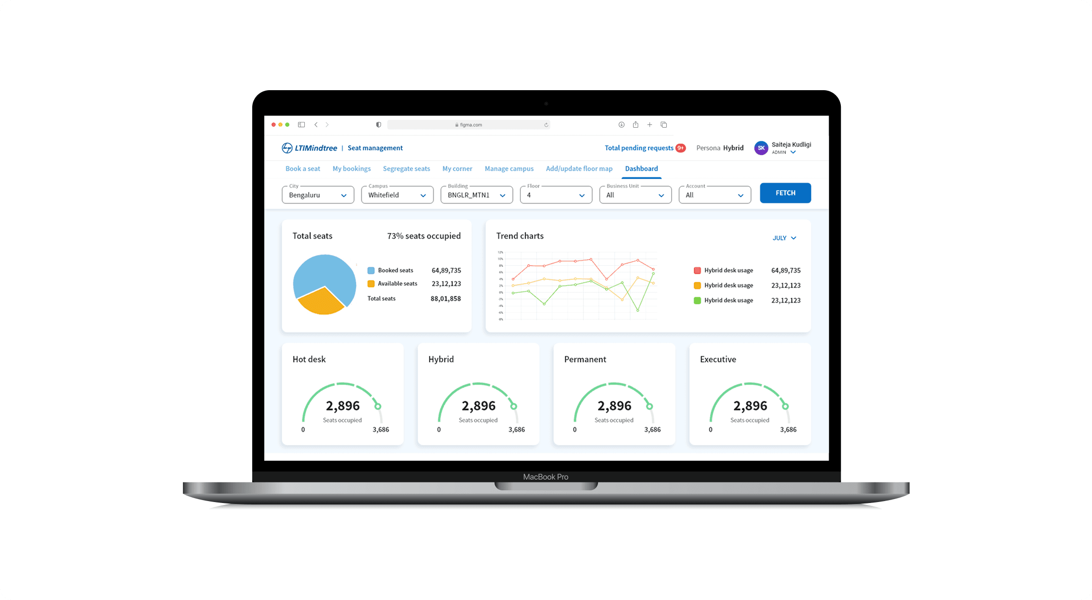
Admin Dashboard & Visibility
Admins get a high-level view of:
Total seats vs occupied seats
Booking types (Hybrid, Hot desk, Permanent)
Pending requests and trends over time
Manage Campus & Configuration
I worked on flows that allow admins to:
Add or update campuses, buildings, and floors
Maintain consistency across locations
Support future expansion without redesigning the core flow
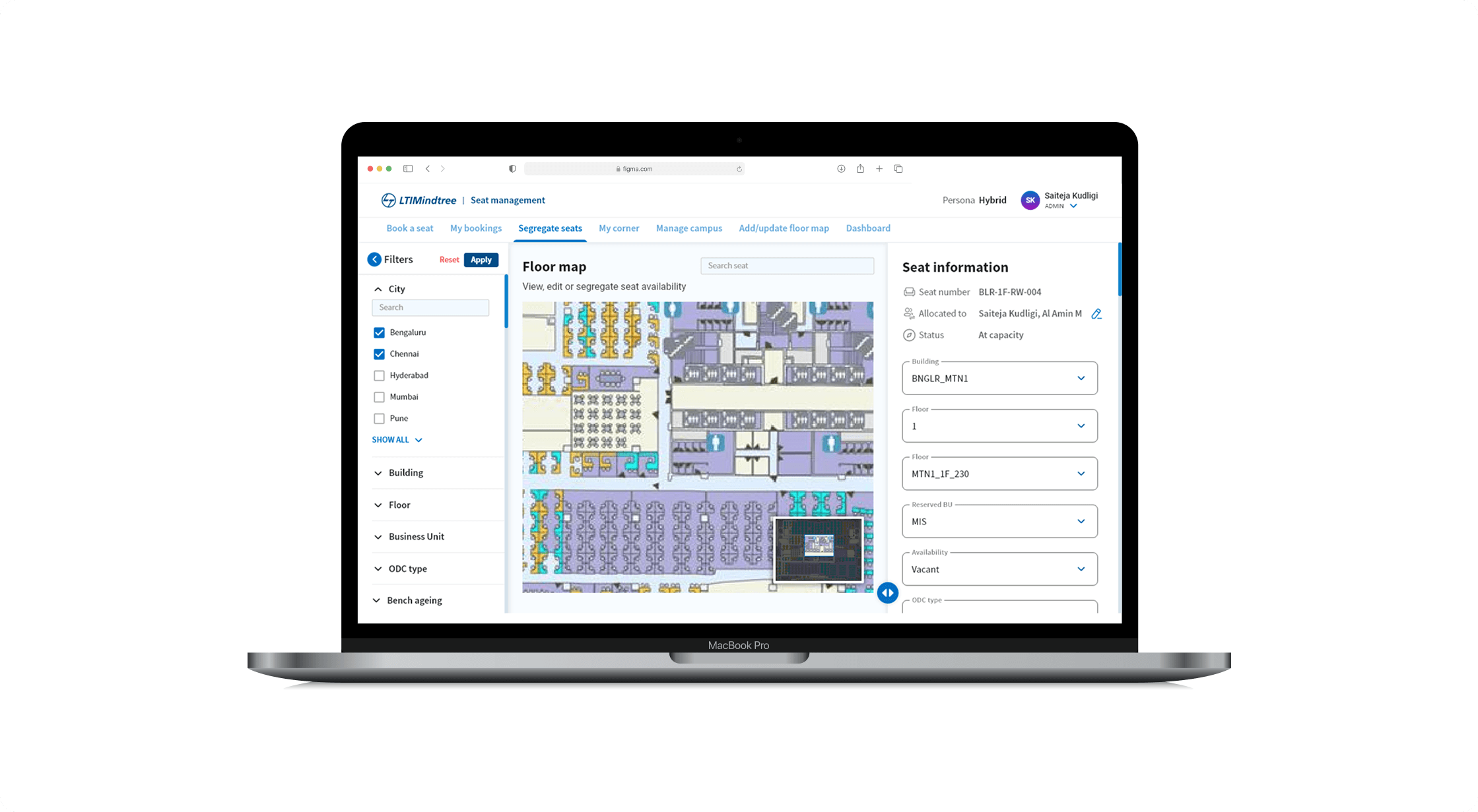
Seat Segregation & Floor Map Management
Admins can:
View and edit seat availability
Segregate seats by BU, ODC type, or availability
Update floor maps as office layouts evolve
Designed to Scale
While the experience feels simple for employees, it was intentionally designed to scale across organizational, operational, and technical dimensions.
What This Project Reinforced for Me
This project reinforced a few core beliefs
Systems should absorb complexity, not pass it on to users
Automation works best when it’s visible and understandable
Heuristics are most effective when applied quietly
Enterprise UX succeeds when human behavior is treated as a design input
What I’d Improve Next
If extended further, I’d explore
Fix all headings to Title case and improve UX writing
Smart reminders to reduce No Show: “Your booking starts in 30 mins - confirm arrival?”
Improve Admin Dashboard by providing cross-campus utilization insights
AI Booking Assistant, users just have to say - Book me a seat near my team on 25 Jan, 10 - 6.
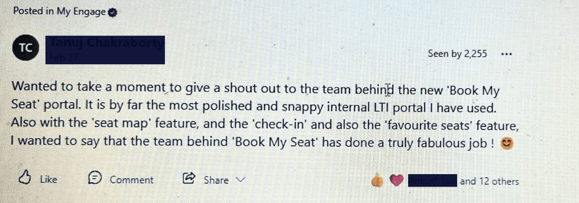
Testimonials
Employees loved the portal so much, they started shouting it out on the company's social feed