HMW Design A Scalable, Low-Cognitive-Load Seat Booking System for Hybrid Workplaces

Overview
After the LTIMindtree merger, dozens of internal enterprise portals were shut down, rebuilt, or stitched together under aggressive timelines. What emerged wasn’t just technical debt, it was an experience debt.
Multiple color palettes across portals
Different icon styles for the same actions
Multiple fonts in parallel use
Identical components rebuilt again and again
Users could feel the disconnect. Teams were paying for it in time, rework, and quality. Individually, each portal functioned well enough. Collectively, the ecosystem became fragmented visually, behaviorally, and operationally. Teams were redesigning and rebuilding the same solutions, accessibility issues kept resurfacing, and users encountered inconsistent experiences as they moved between tools.
This case study documents how I identified this as a system-level design problem, aligned cross-functional stakeholders around it, and led the creation of a scalable, accessibility-first design system that now supports 30+ enterprise portals and 350K+ global users.
Role
Senior Product designer
Design System Lead (end to end)
Project tenure
6 months
Stakeholders
Developers, Product Managers, BU Leads
TL;DR
When I joined LTIMindtree, LTI and Mindtree merged into a single entity. Post-merger, LTIMindtree’s internal enterprise tools suffered from fragmented UI patterns, duplicated effort, and recurring accessibility issues. I led the creation of a scalable, accessibility-first design system that reduced redundancy, accelerated delivery, and now supports 30+ portals and 350K+ global users.
The Real Problem
On the surface, this looked like a visual consistency issue. In reality, the deeper problem was redundant effort at scale.
Designers repeatedly redesigned the same components
Developers rebuilt identical UI patterns
QA teams re-tested familiar behaviors
Accessibility issues resurfaced with every new build
The system wasn’t broken, It was lacking a shared foundation.
Design Goals
Before proposing solutions, I wanted to ensure my assumptions matched reality. I combined:
Employee surveys, to understand booking patterns, repetition, and frustration points
Stakeholder interviews with facilities and admin teams, to understand policies, edge cases, and operational constraints
Rather than treating employees and admins as separate audiences, I focused on how decisions made in one flow impacted the other.
UI Audits
I manually audited 12 enterprise portals across: HR, Finance, VMS, QMS and Internal admin tools
I documented inconsistencies in components, buttons, form fields, spacing, iconography, and interaction states.

The output wasn’t just a list, it was a visual inventory. When stakeholders saw identical components presented in 6–8 variations side by side, something clicked
What Stakeholders Highlighted
I ran 1-on-1 sessions with 6 front-end developers, 3 QA leads, 4 BU directors, sales and marketing teams
Developers mentioned: every project rebuilds components. Different designers design the same component differently.
QA leads mentioned: they keep running into accessibility issues. Testing the same components differently in each portal
BU leads mentioned, all portals look like distant cousins, not siblings
Sales and Marketing teams mentioned, even though companies merged, portals haven't!
Stakeholders highlighted issues from their lens. But, at the core problem is same.
I didn’t start by designing components. I started by answering one question for leadership
Why should we invest in this now?
This reframing helped shift the conversation from “nice to have” to “operational necessity.”
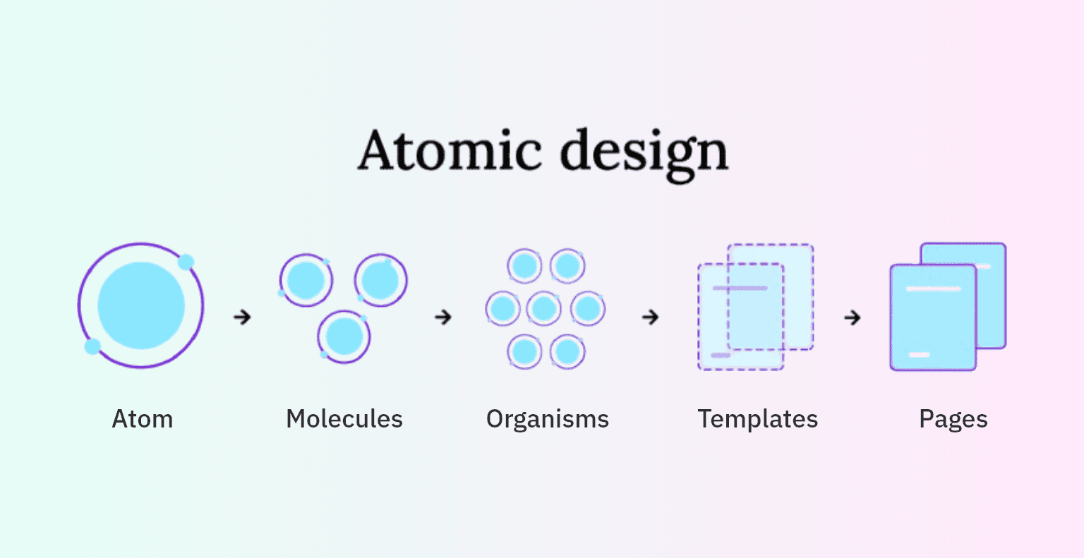
Why Atomic Design?
It was chosen because it aligned with how enterprise products actually scale.
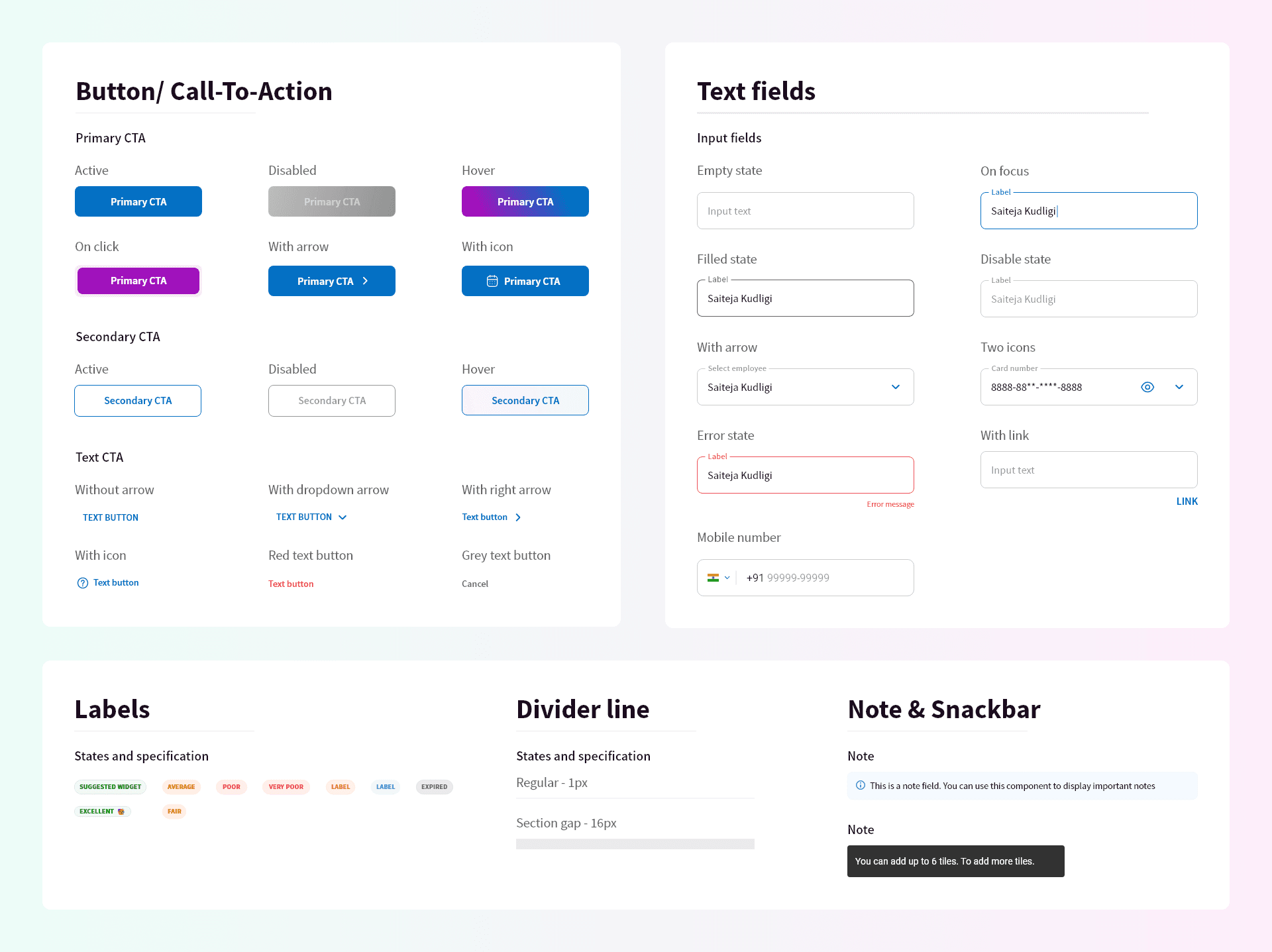
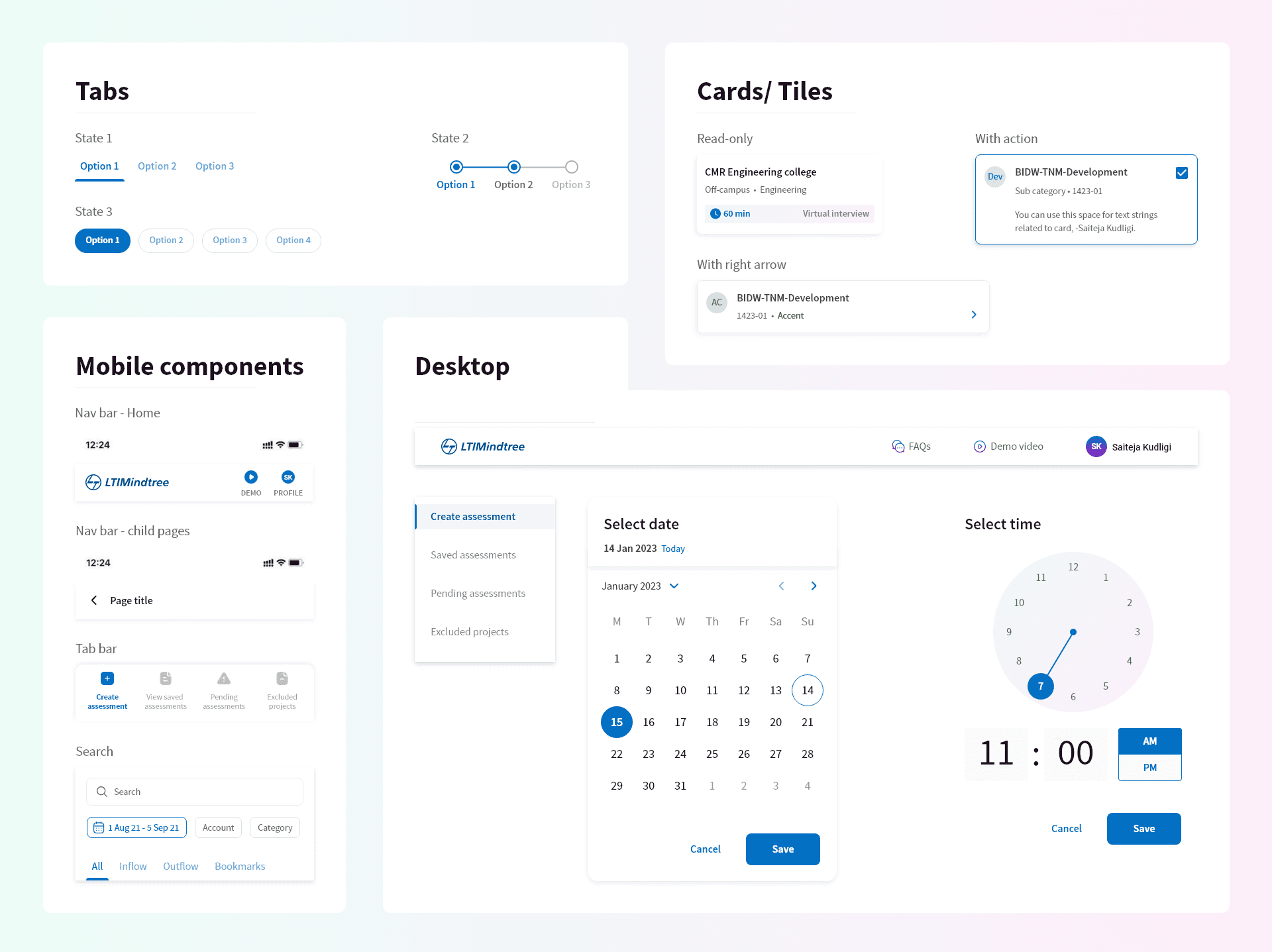
Foundations
Color tokens, typography, iconography, spacing grids (aligned with brand book)
Components
Buttons, inputs, dropdowns, alerts, nav bars, tabs, tables
Accessibility
All components passed WCAG 2.1 AA guidelines
Documentation
Included rationale, examples, do’s/don’ts per component
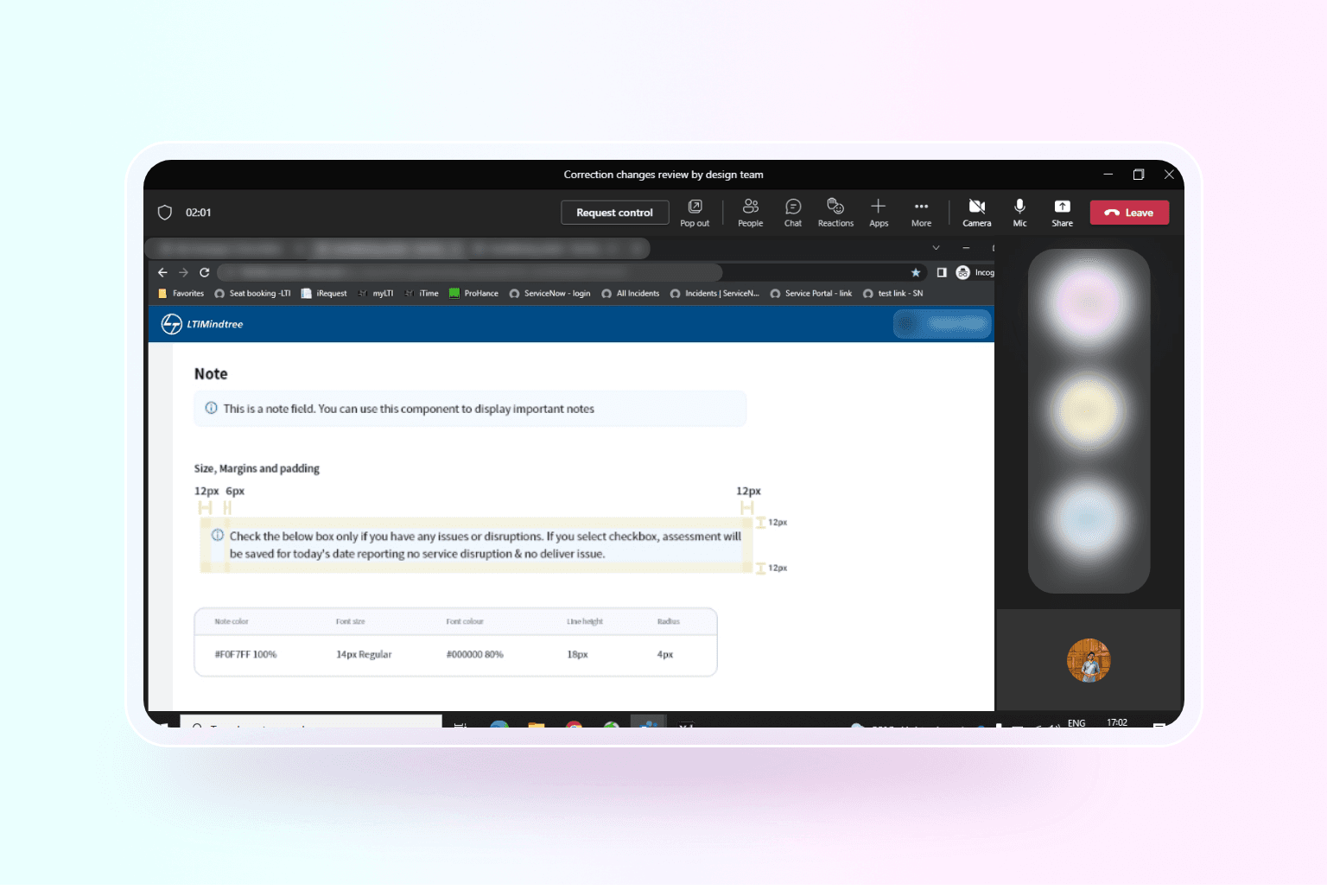
Adobe XD’s Developer View was critical for handoff, developers could easily copy measurements, color codes, and text properties directly from the design. This significantly reduced the time spent on manual annotations or redlining.
Why Atomic Design?
It was chosen because it aligned with how enterprise products actually scale.

Adoption Challenges & Course Correction
After the merger, workloads increased significantly.
Momentum around long-term initiatives slowed, and motivation dropped.
This is where many design systems stall. Instead of pushing for full adoption, I shifted focus to immediate value.
Ready-to-use components
Pre-built templates. Intentionally avoided over customizing components for individual teams.
Drop-in patterns teams could use immediately
The system stopped feeling like “extra work” and started saving time.
While avoiding over-customizing of components for individual teams created short-term friction, it prevented long-term fragmentation and ensured the system remained scalable.
Teams began adopting it organically, because it made their jobs easier.
Timeline & Process Breakdown
I breakdown of the entire process, and simplified it for the sake of case study
Developer Handoffs & Governance
The goal wasn’t control, it was consistency and trust.

Co-developed components with front-end teams using Storybook
Integrated into both React and Angular projects
Emphasized reusability by building scalable, variant-rich components that could be consumed across multiple products
Weekly design-dev reviews ensured XD–code consistency
Storybook became a centralized UI library, making it easier for devs to explore, test, and consume components without ambiguity
My knowledge of front-end helped navigate edge cases quickly and speak the dev language fluently during integration
Operationalizing Design
To make the system a living asset, I've conducted design audits and this made collaboration easy.
Rolled out Design Audits to review development builds
Documented changelog & component design guidelines to avoid confusion
Pushed the Design System to cloud, so that designers from other BUs can drag and drop components.
Trained designers on correct Base Component usage and instituted peer reviews to eliminate phantom instances (hidden overrides).
Amazing Metrics & KPIs
It started small but brought a significant changes in the time, efficiency and ease of shipping portals
80% reduction in redundant UI styles
30–40% faster design-to-development handoffs
20+ portals adopted within 6 months
30+ portals actively using the system by the end of 2023 (when I left the organization)
Teams stopped debating visual decisions
Designers focused on solving new problems
Developers reused instead of rebuilding
Products felt related, not fragmented
What I’d Improve Next
If extended further, I’d explore
Redesign the entire system in Figma using tokens. Currently in Adobe XD, software used by LTIMindtree
I'd document every component much detailed, not just do's & don'ts.
Dive deep in to glass morphism and liquid glass effects. Current system is built on simplicity & efficiency for enterprise portals
Integrate existing components with AI workflows


